Town & Country welcomes Bradbury at Society
Here at The Society, you can be in the heart of it all one moment, and away from it all a moment later. Your own private escape, a resort to recharge and reconnect, until you're ready once again to leap to where life has yet to take you.
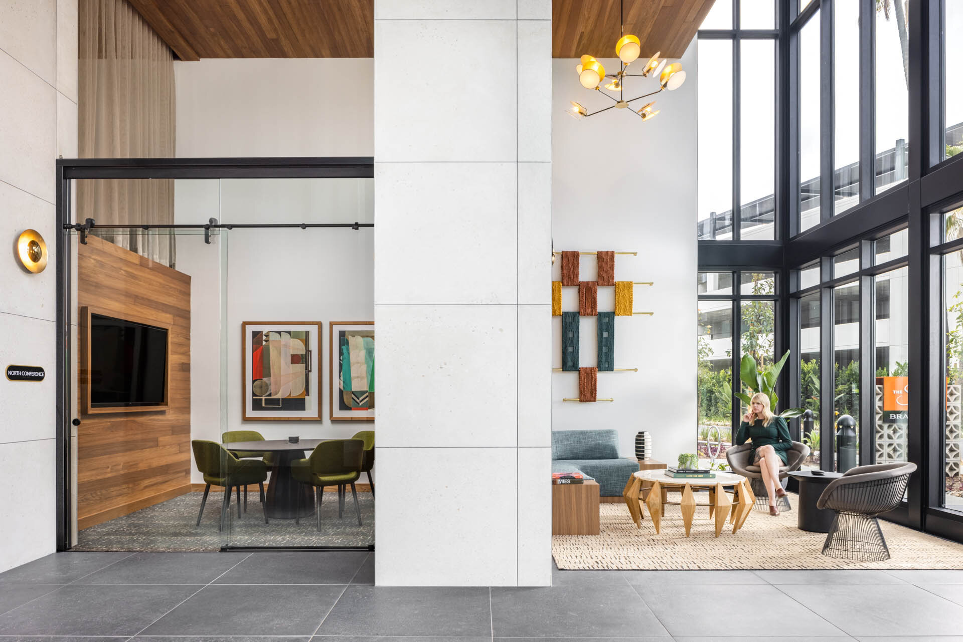
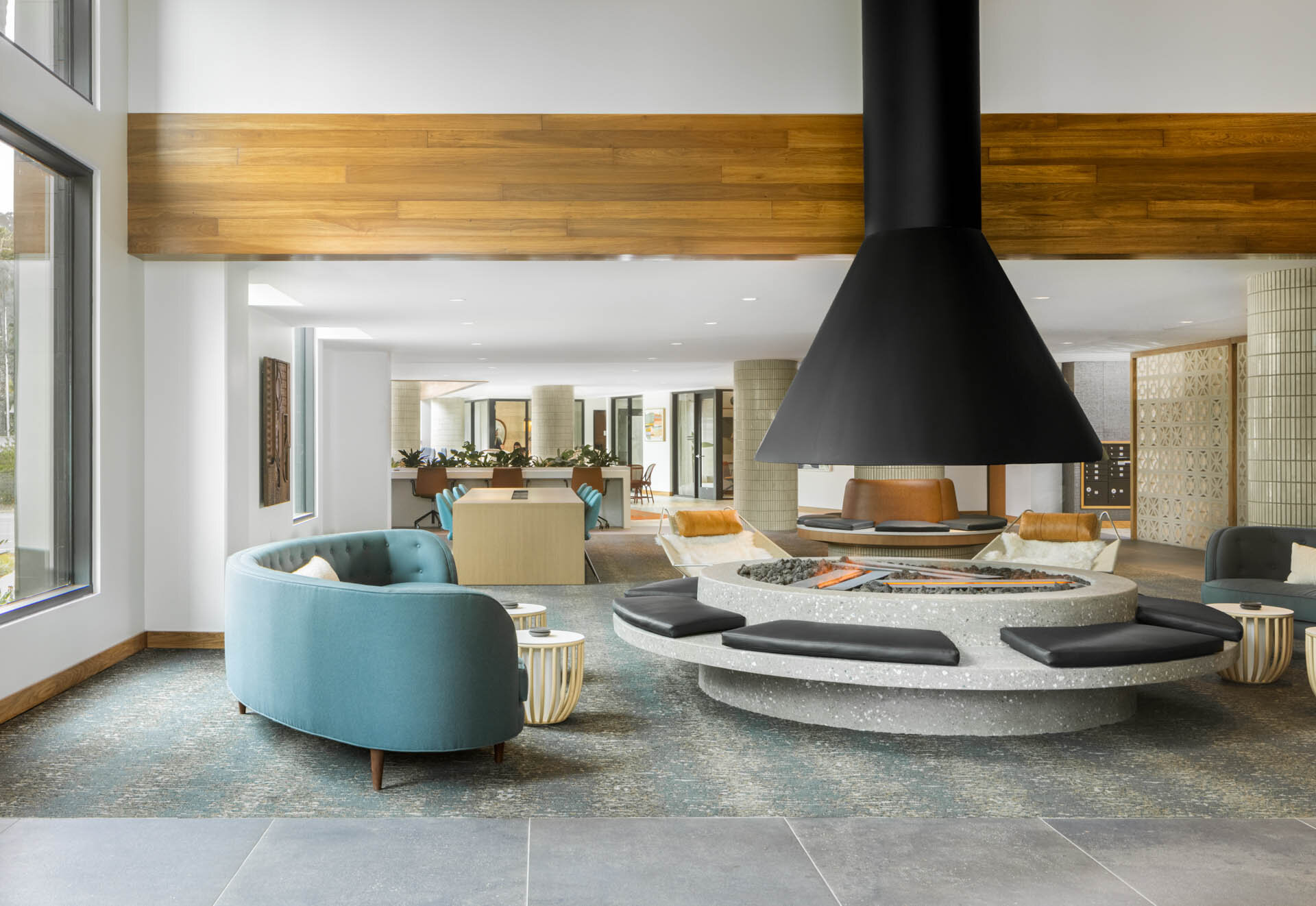
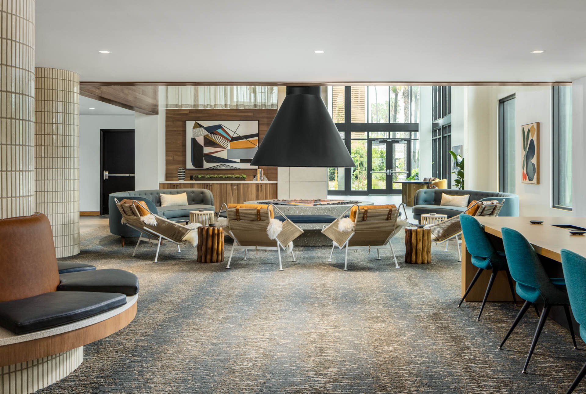
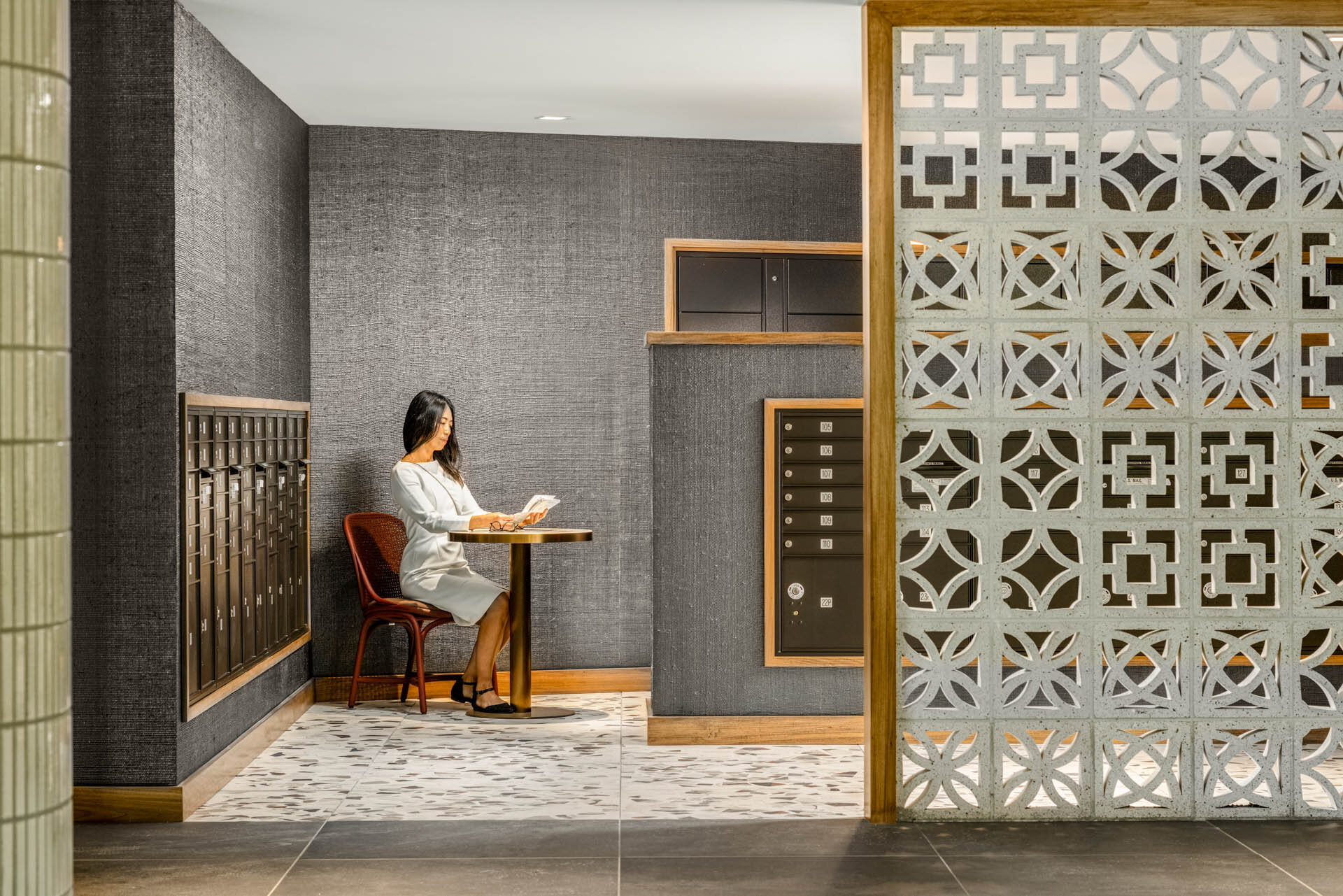
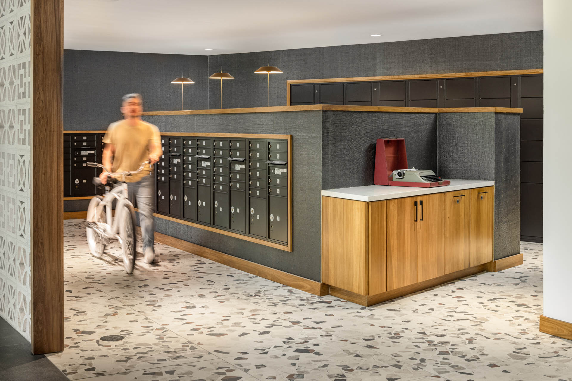
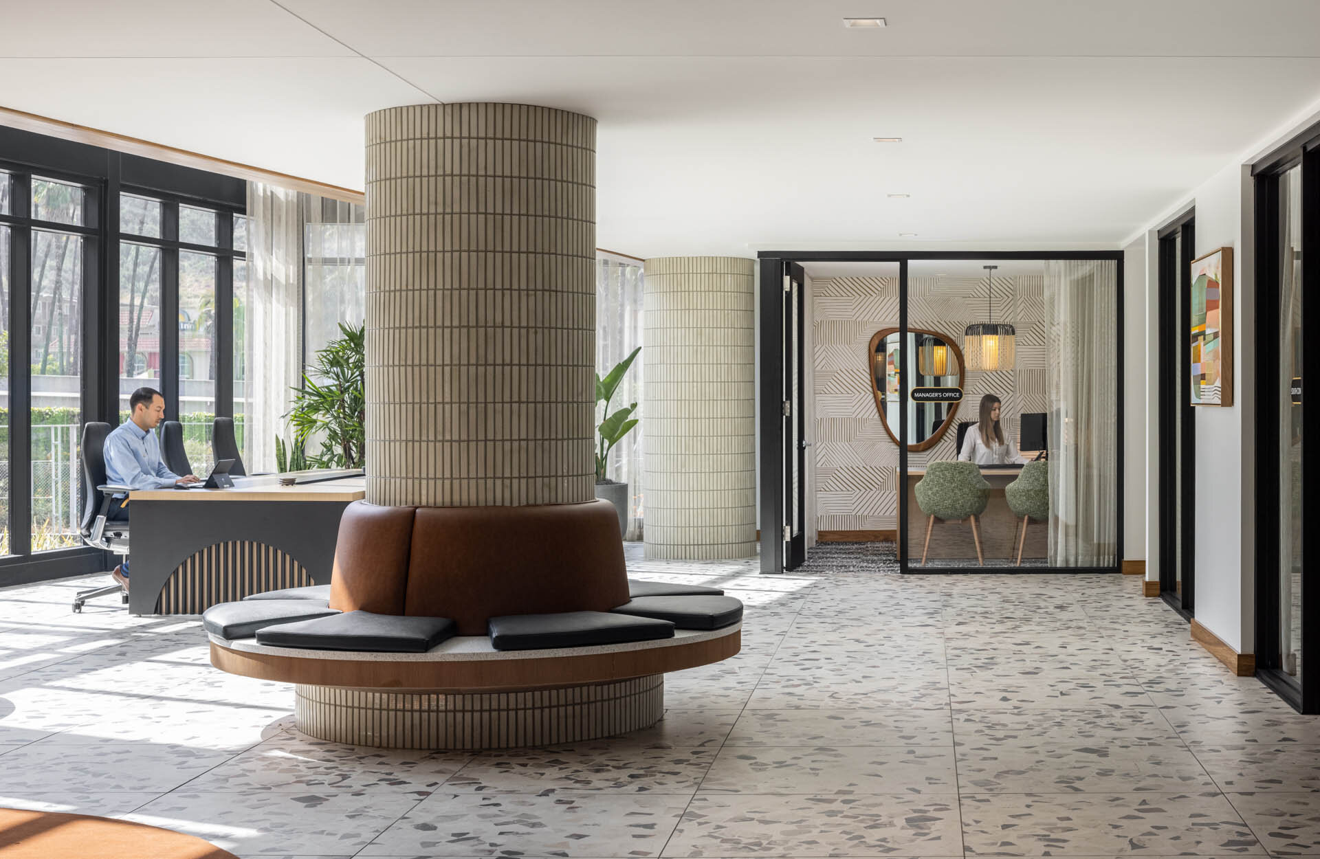
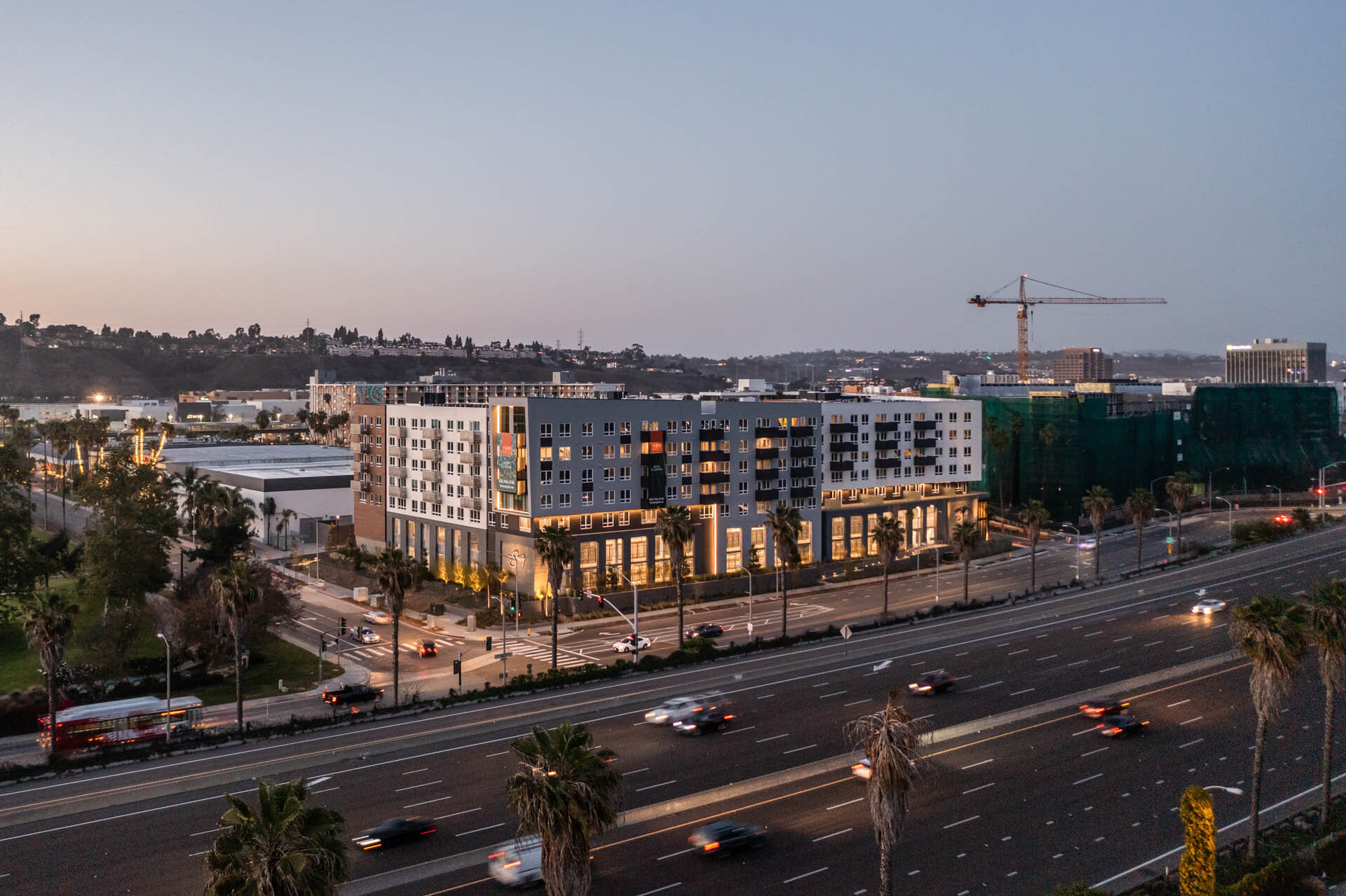
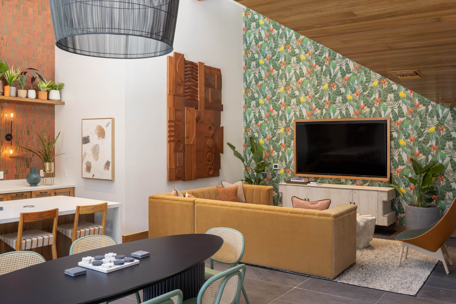
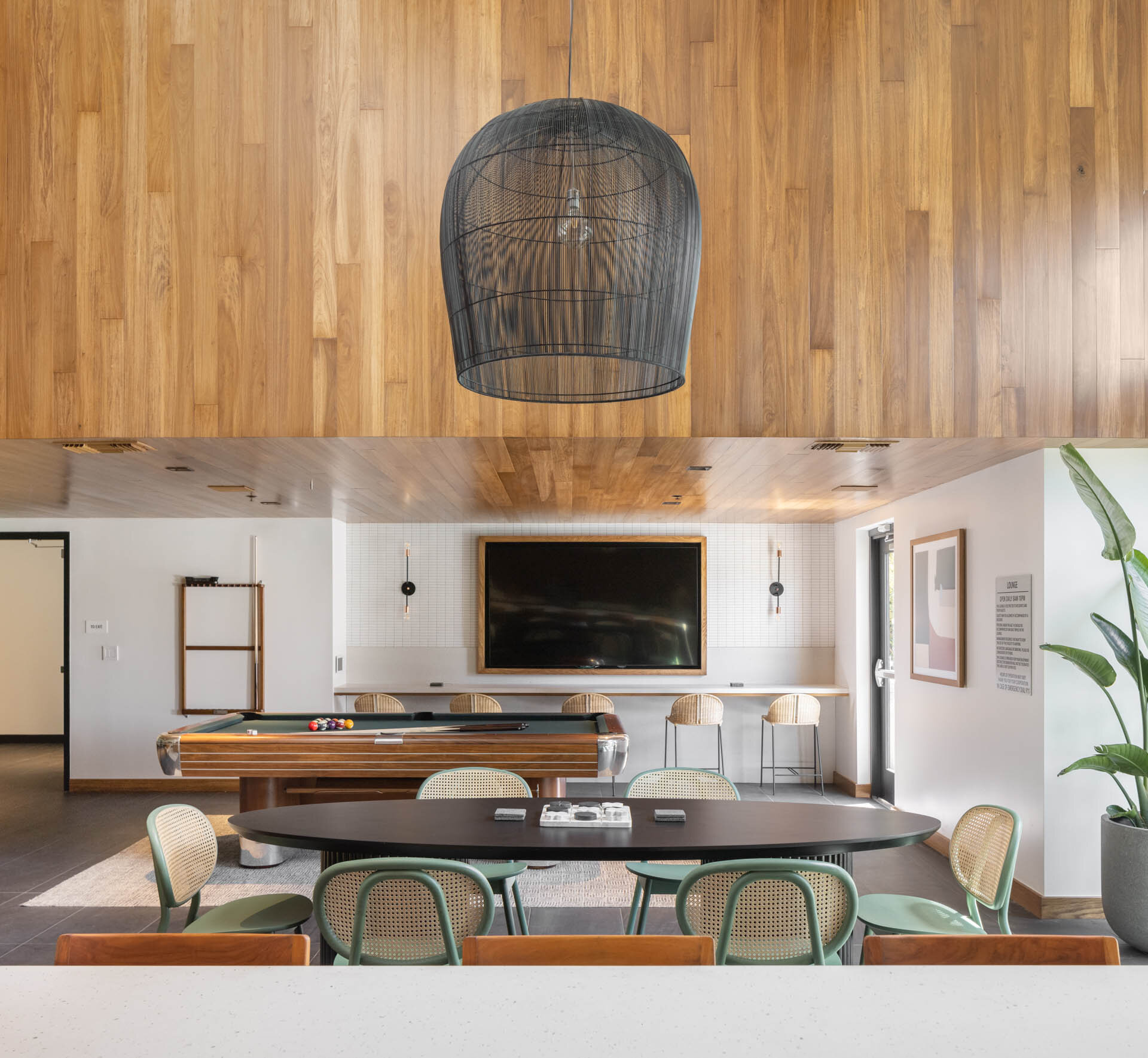
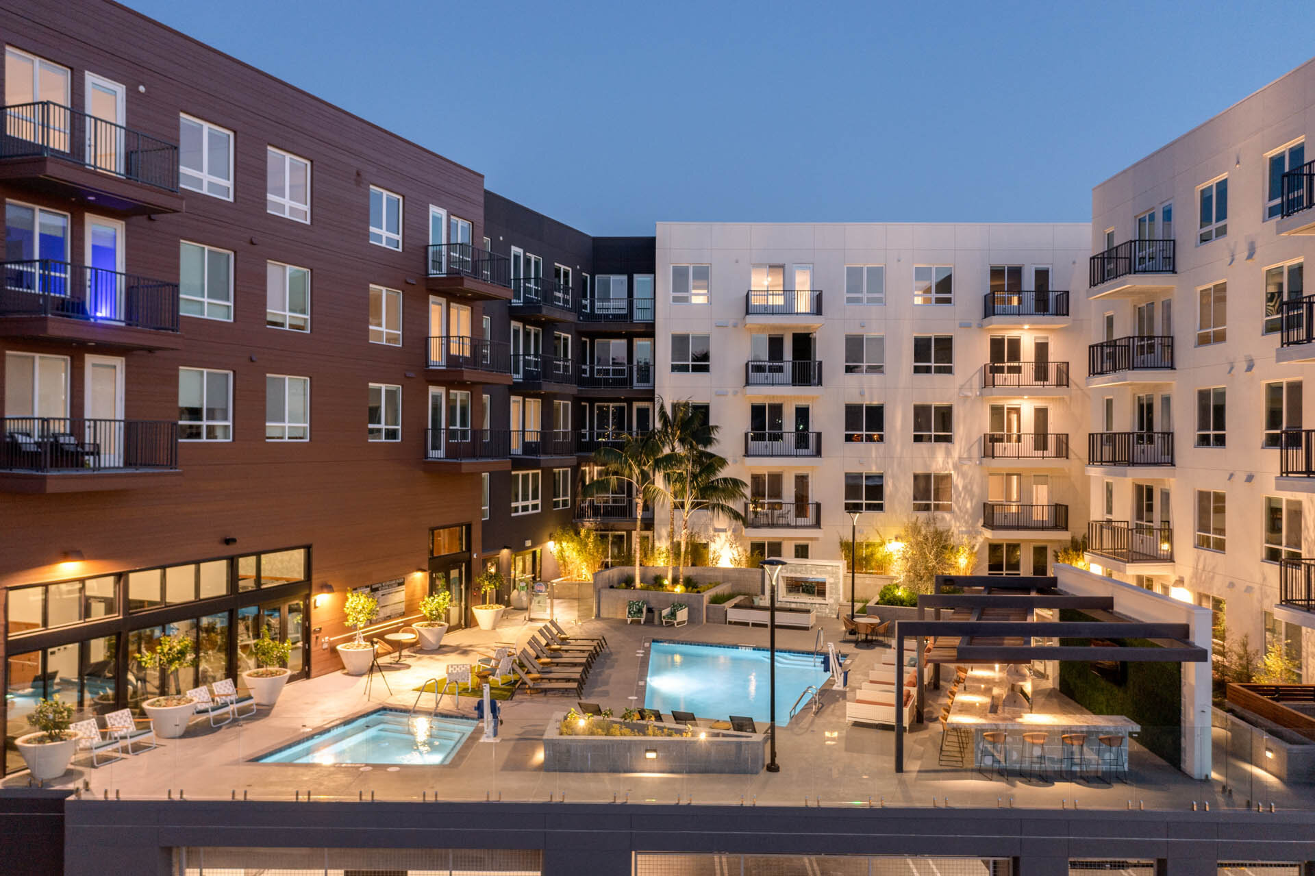
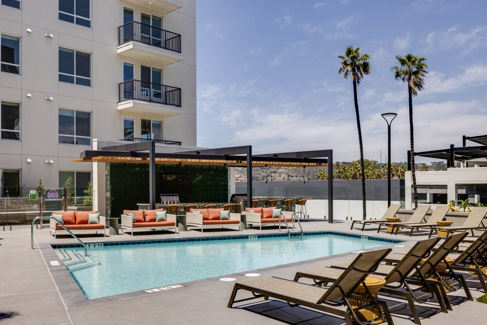
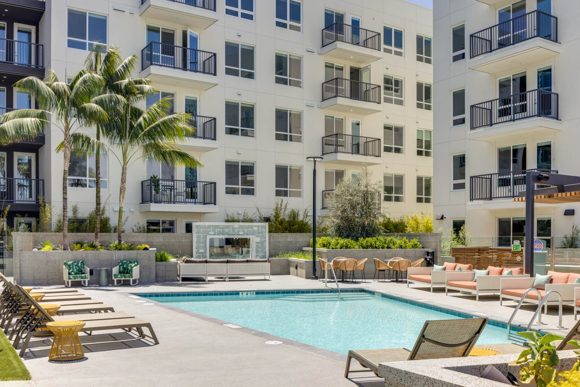
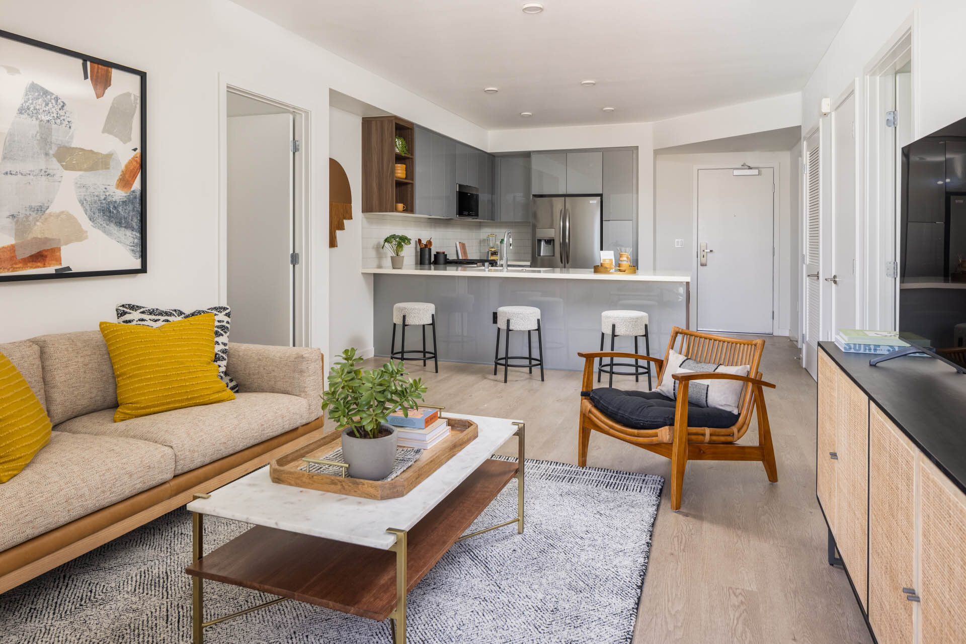
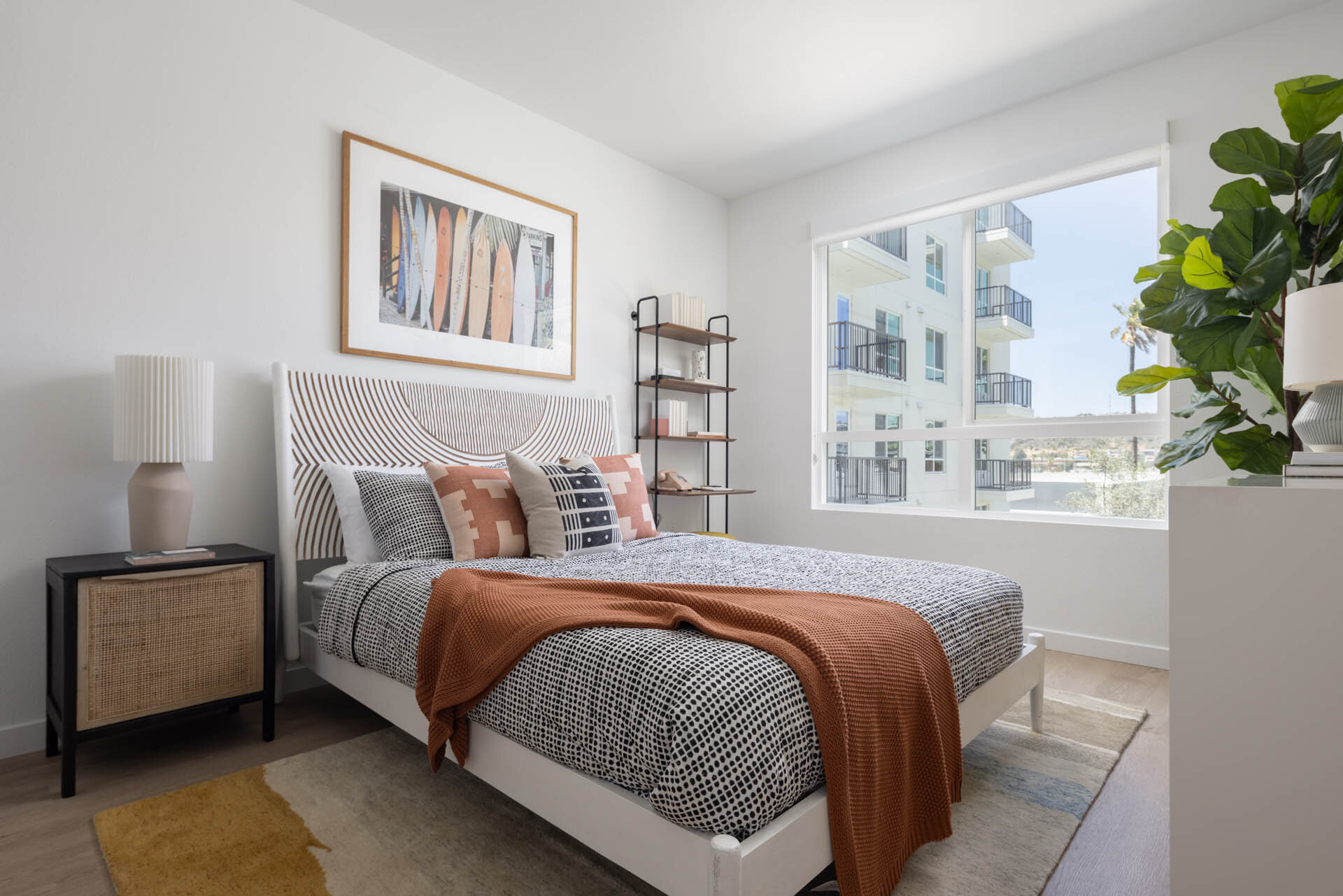
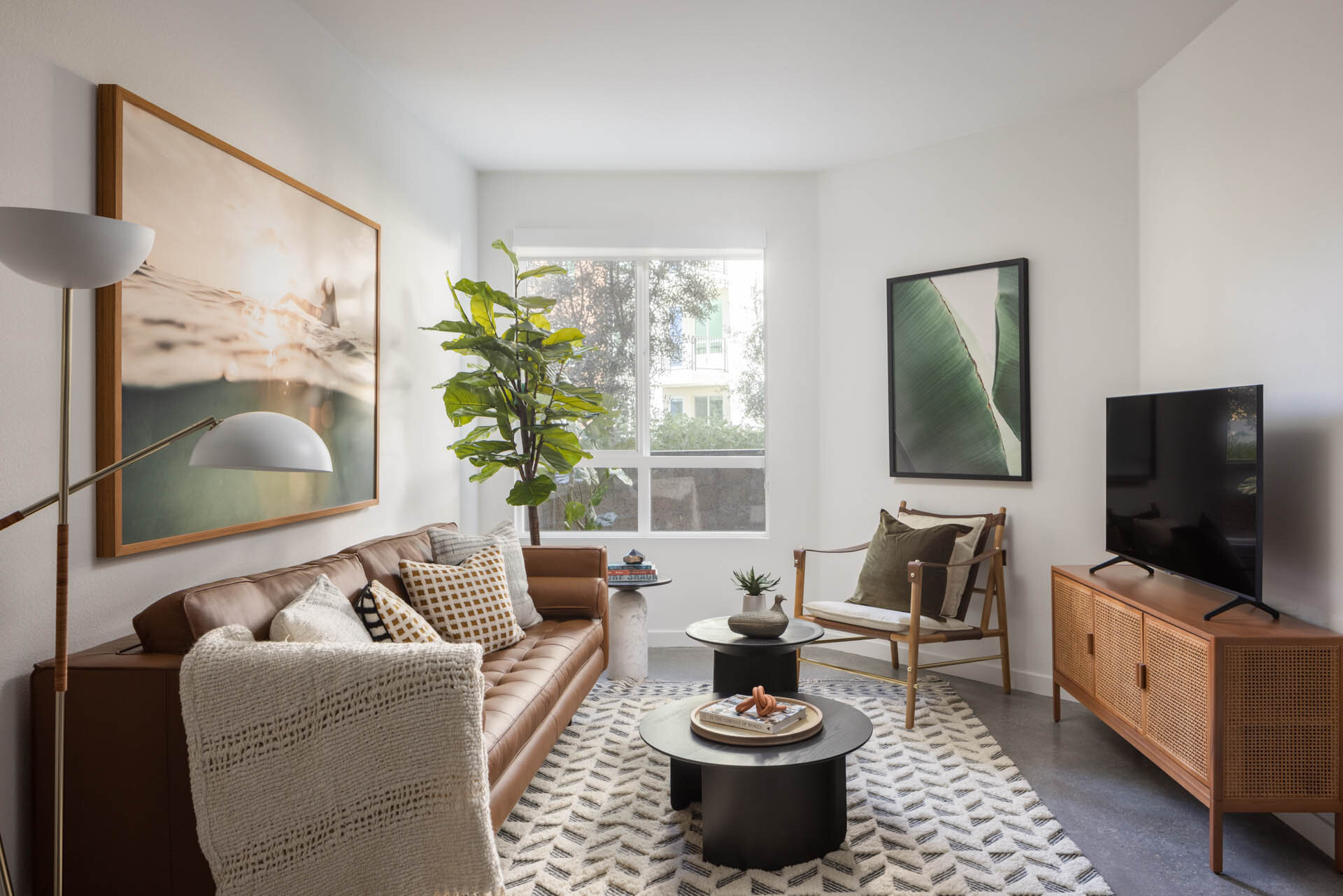
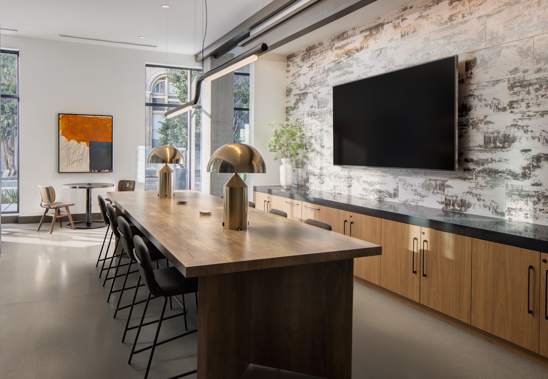
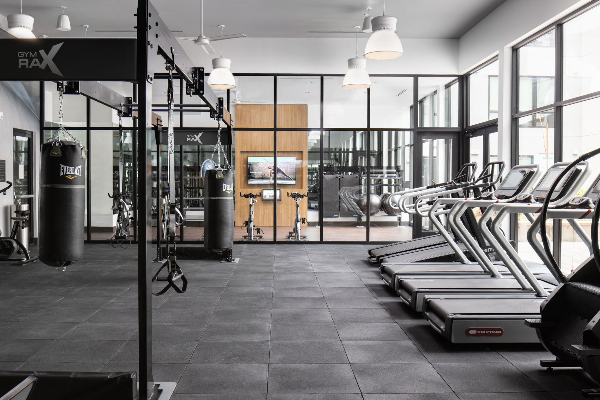
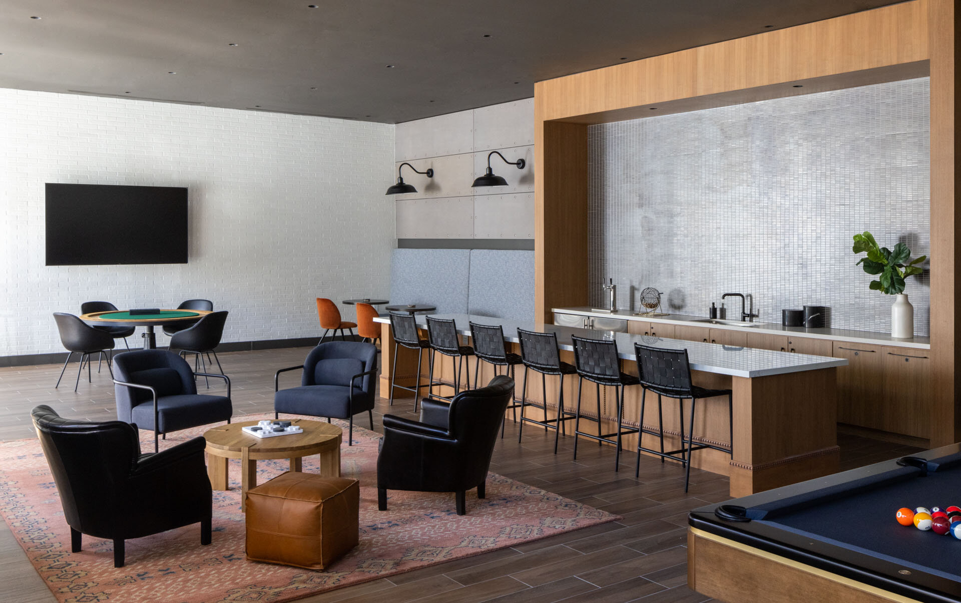
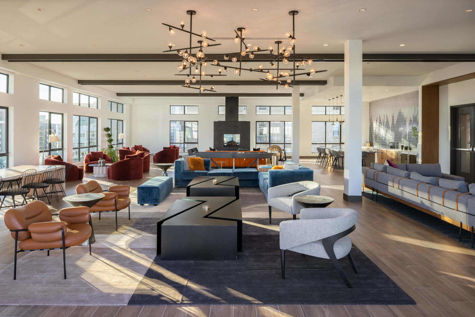
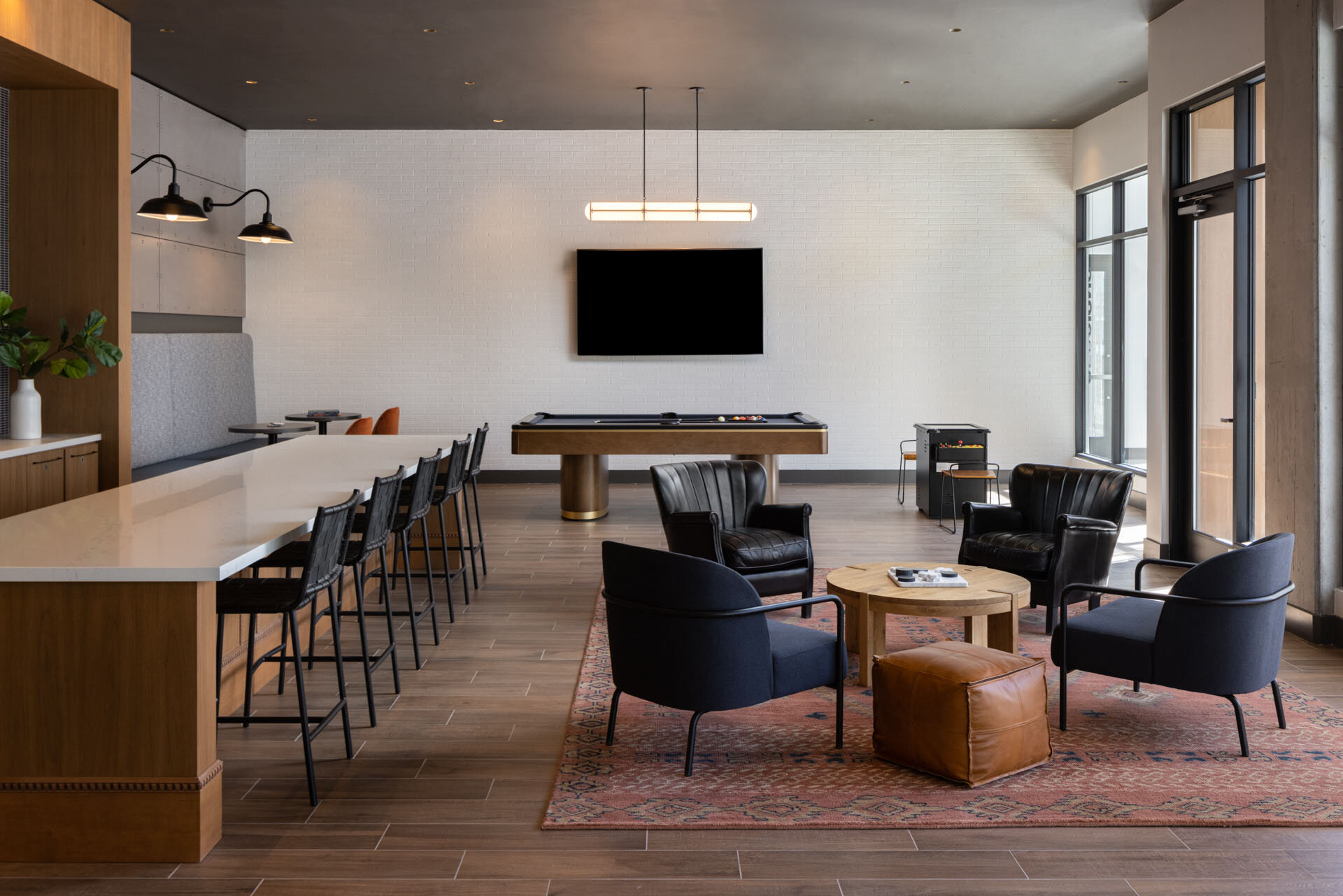
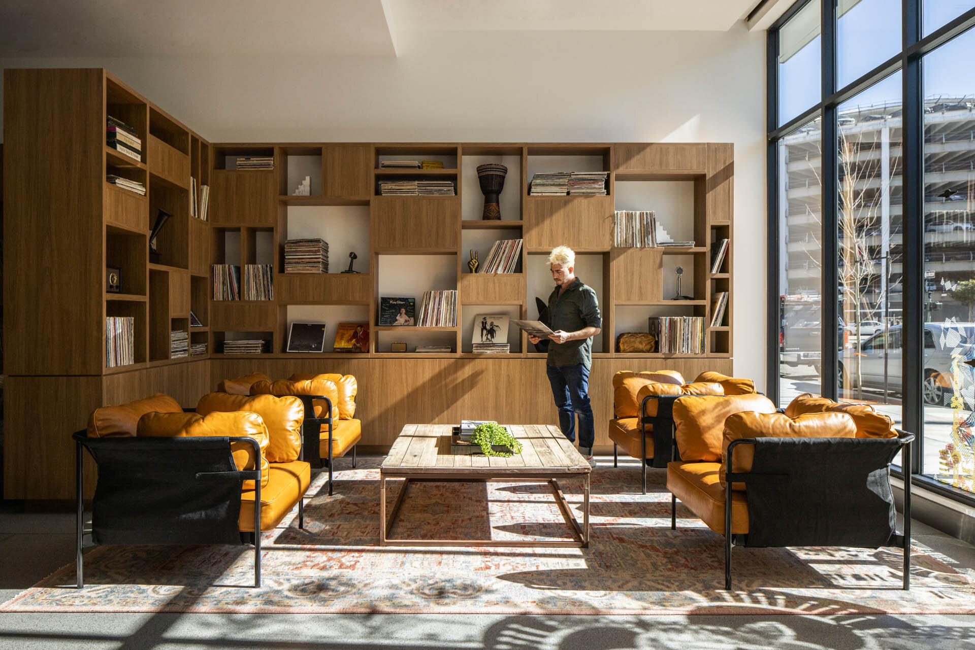
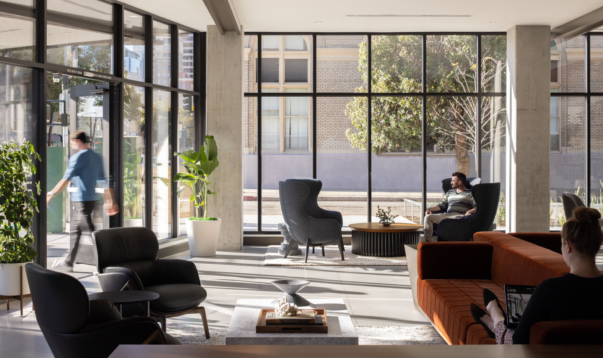
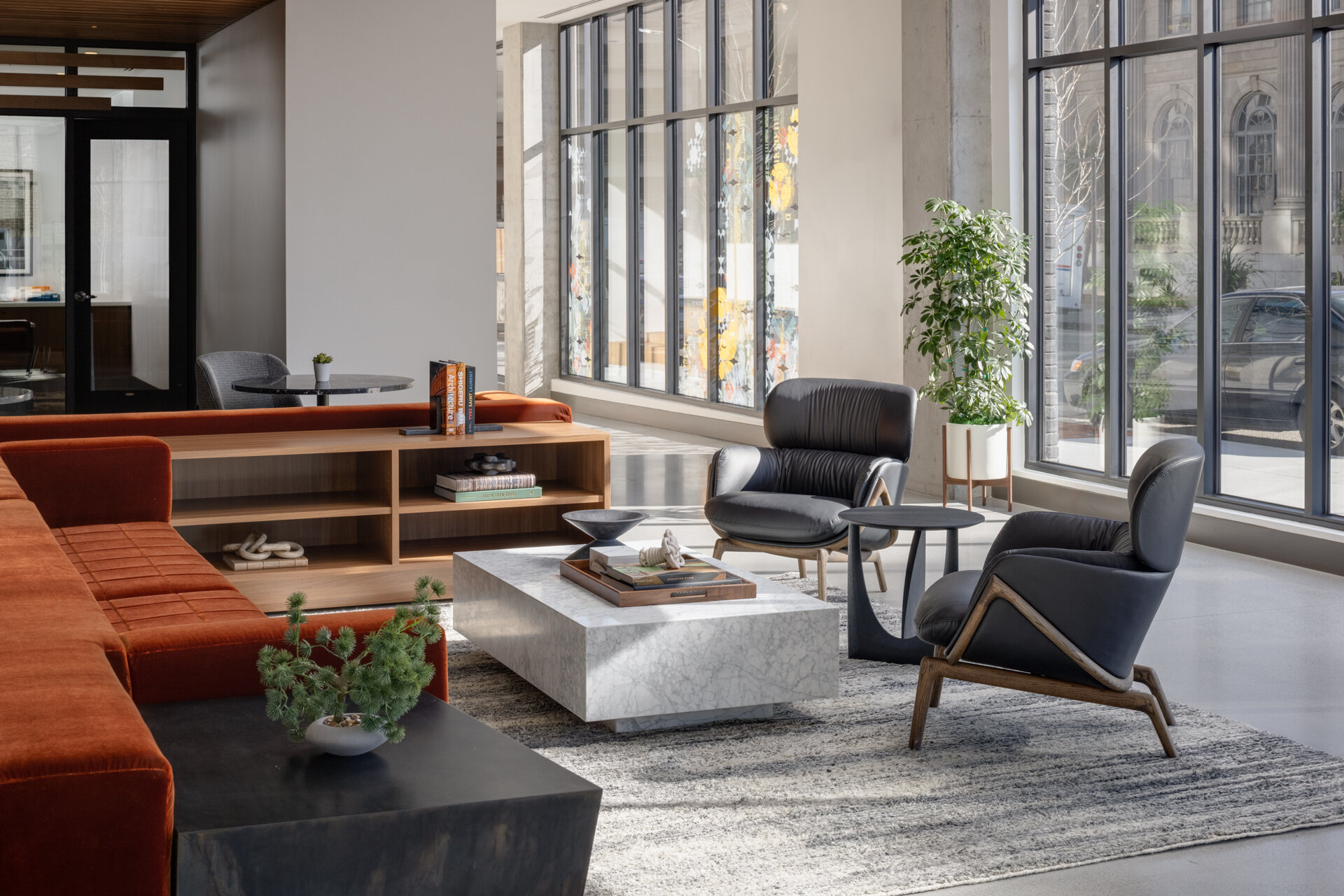
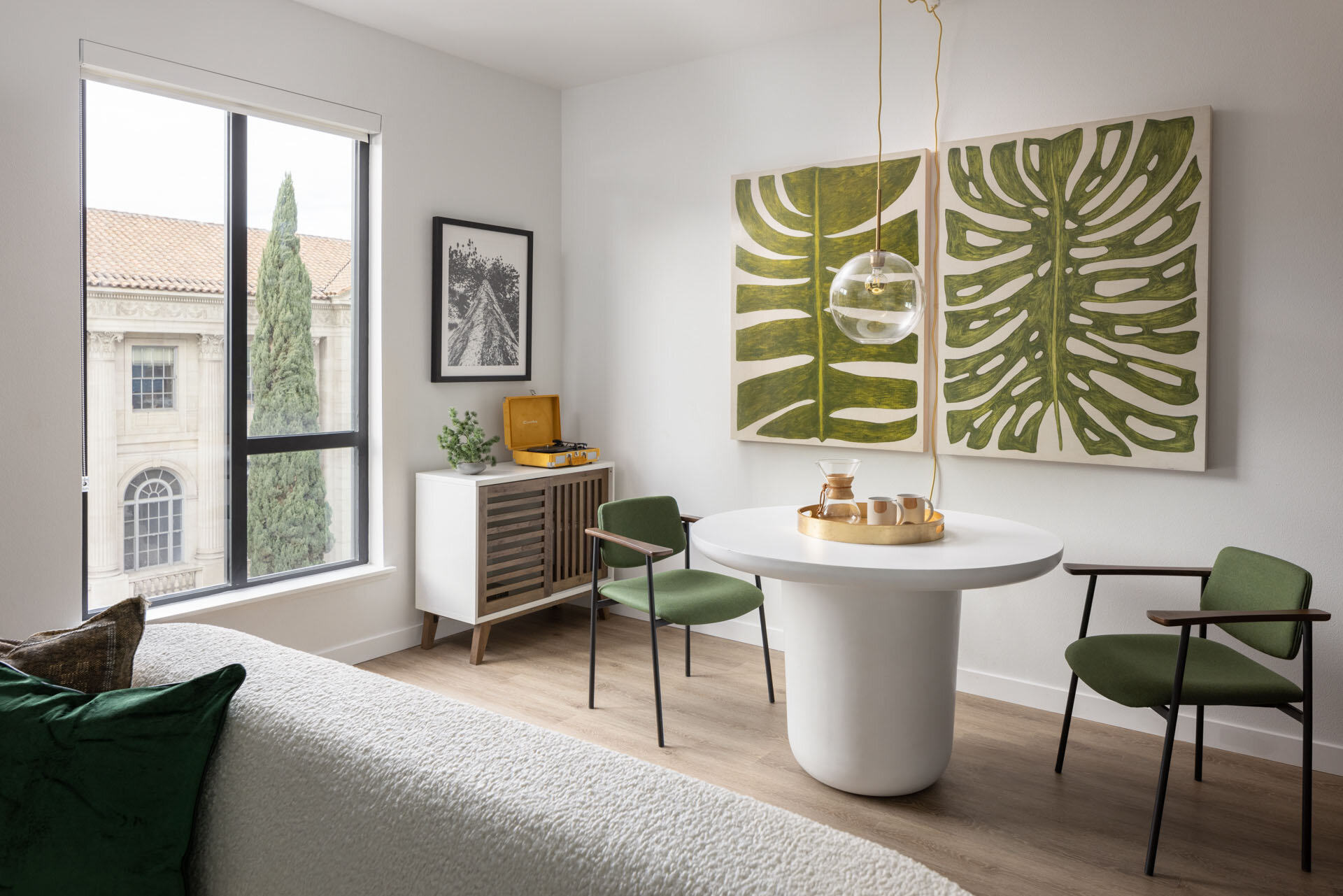
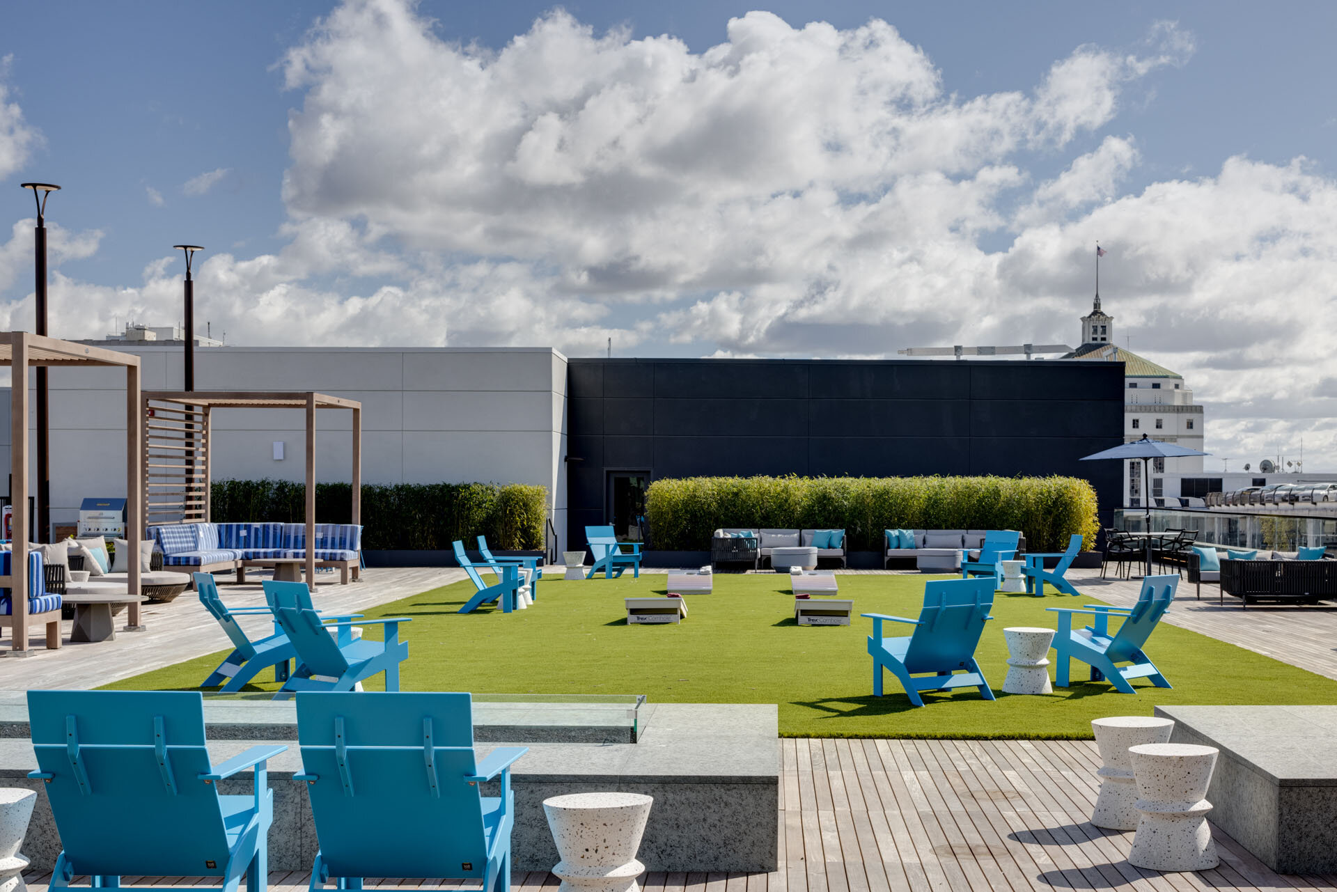
I recently took a trip over to San Diego to check out The Society, a massive complex sporting 840 luxury homes ranging from one to three bedrooms in the greater Town and Country Resort development area. Headed up by Holland Partner Group, who has several other properties currently underway in the area, this particular shoot was a real treat to be involved in as it brought me into a new developmental area that I was excited to see the details of. As much of the luxury real estate in San Diego, this complex offers a massive list of onsite amenities and pays special attention to the comfort and efficiency of life for those who reside within it. Among this list of amenities you can find everything from round sided pools to bicycle storage to yoga studios. You can tell that Holland thought of everything when commissioning the work within this complex as it ensures that everything your heart could want is within arms reach.
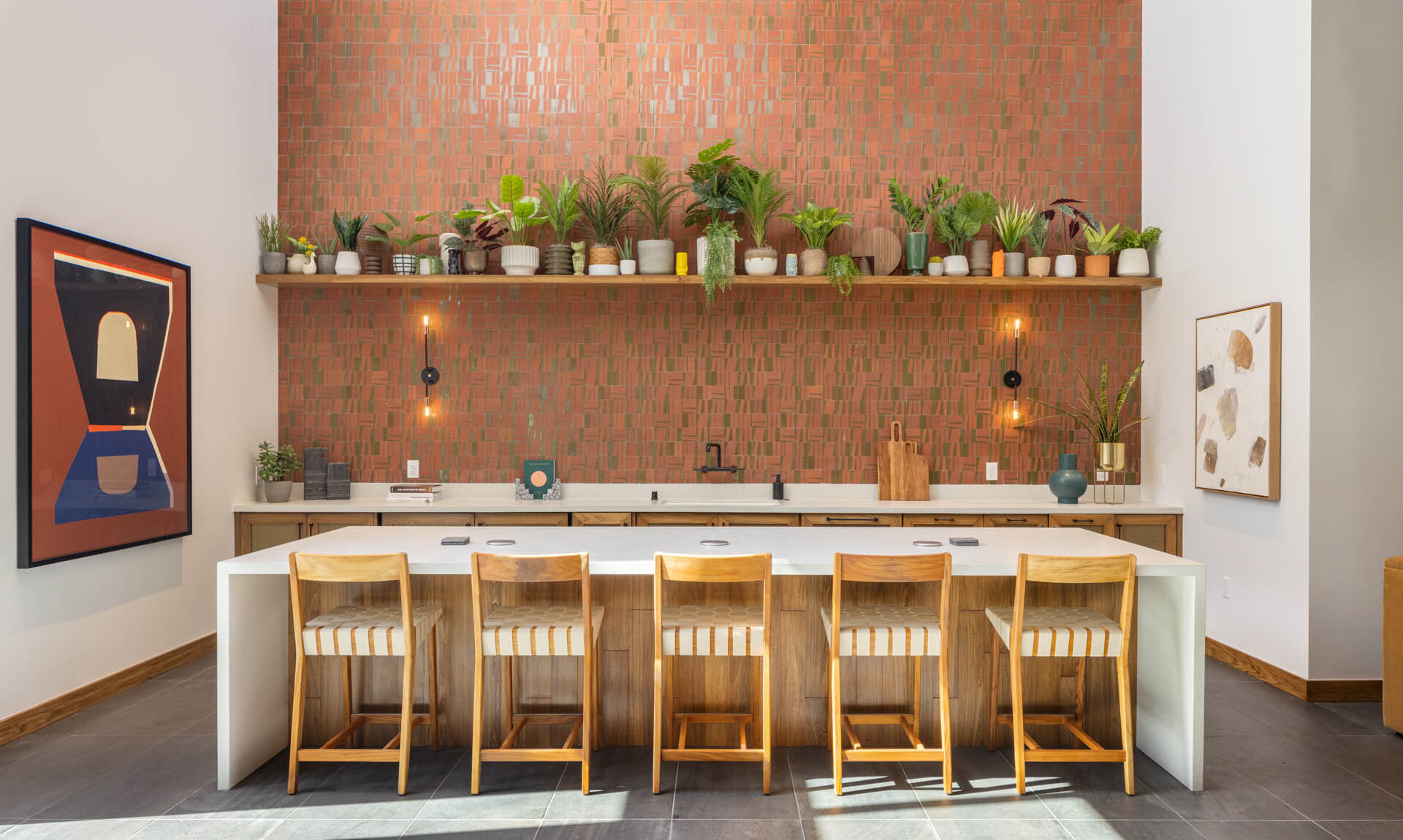
For this shoot I brought along long time fan favorite Andrew Bramasco as well as Corey Gibbons who helped design, style and execute the plan for capturing all this space has to offer. With Holland Partner Group planning another four developments within this community, and knowing the work that comes from their firm I am confident that The Society will become it’s own microcosm of luxury. Designed immaculately by Vida Design PDX the interior of this massive complex is brimming with artistic details and unexpected juxtapositions common for the San Diego real estate market. Overseeing this entire operation is NASH Communities, a well respected and amazing company who is involved with developments across the country and who manage to keep the focus on ensuring that their developments are true to the area and delightful for those who choose to live within them.
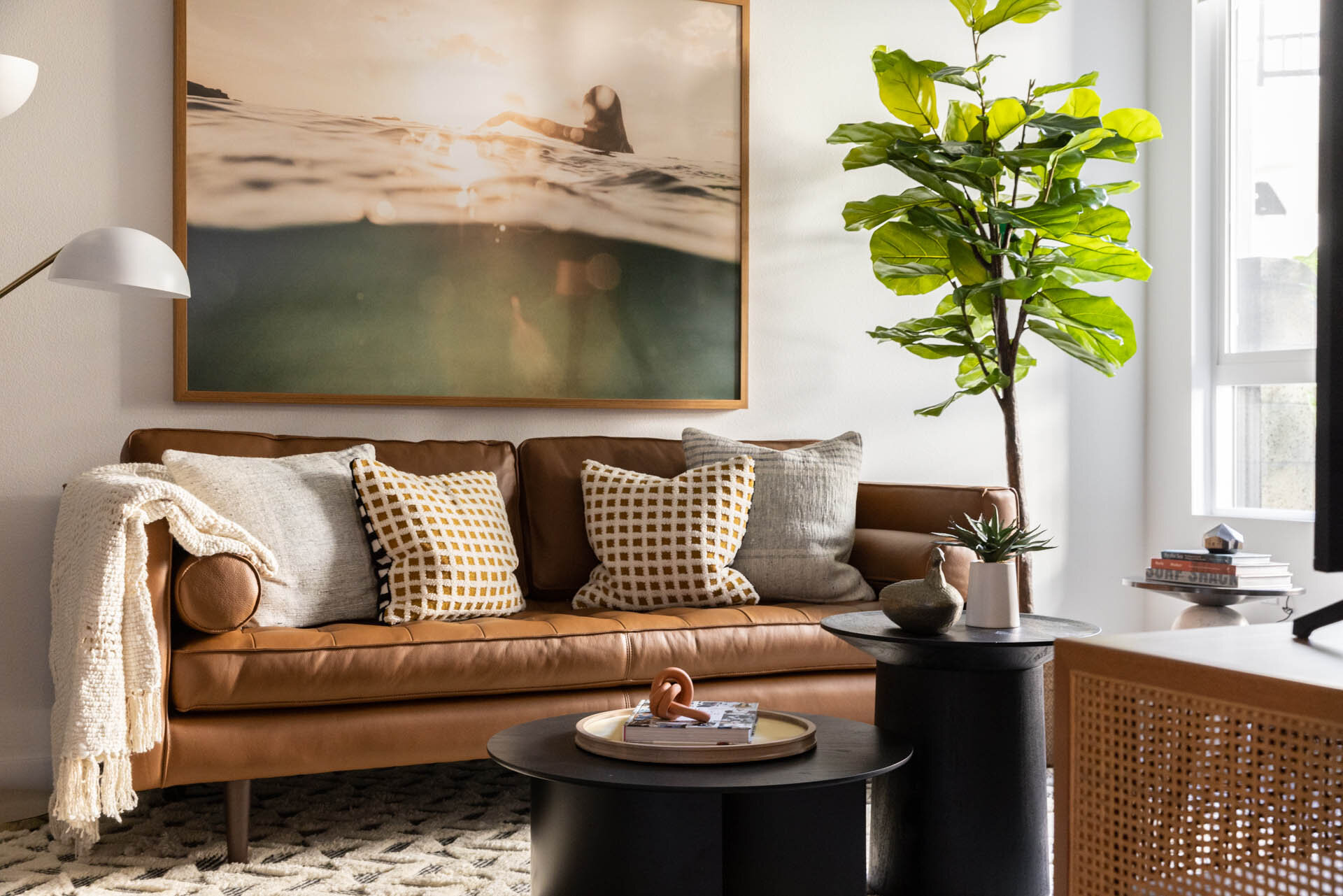
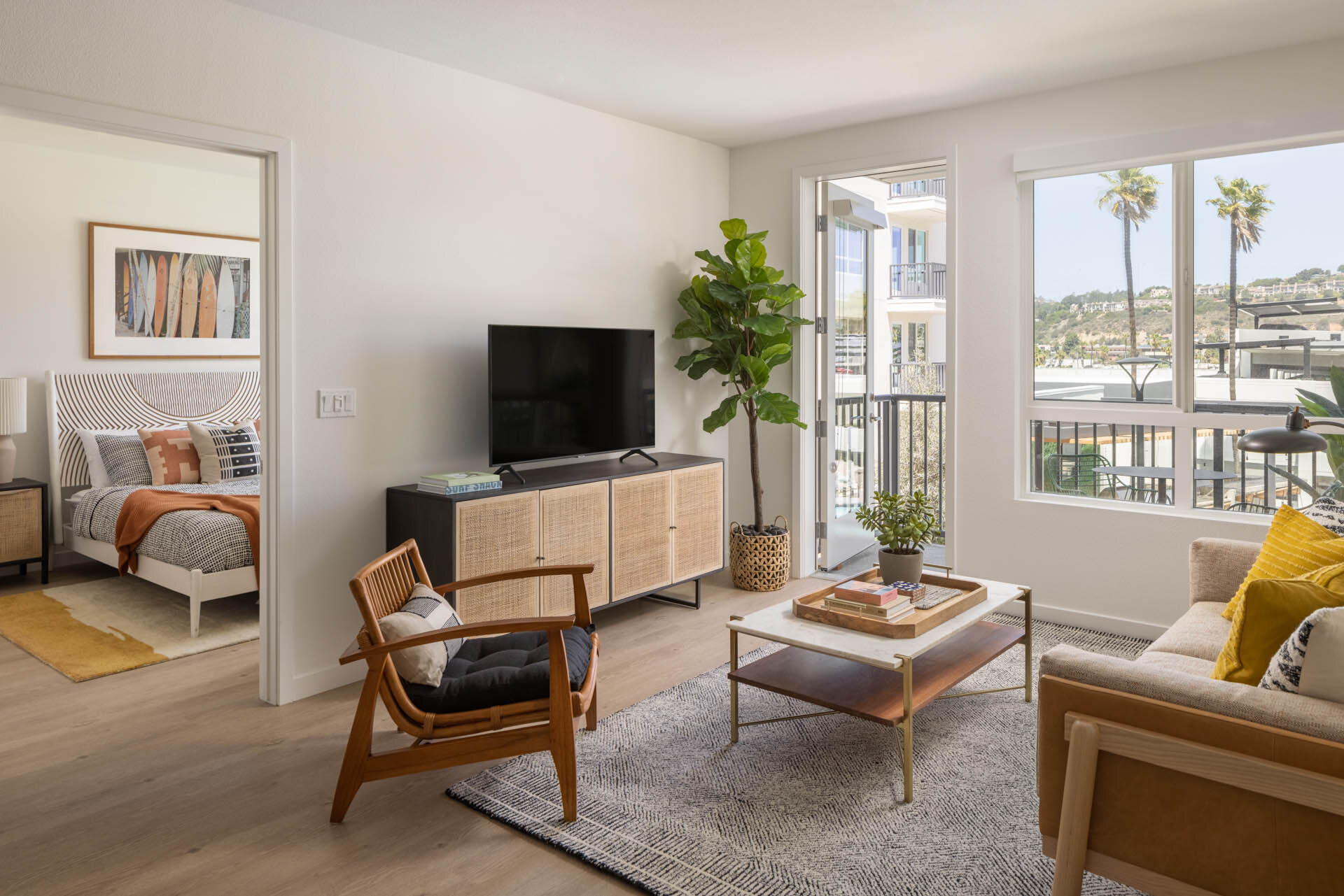
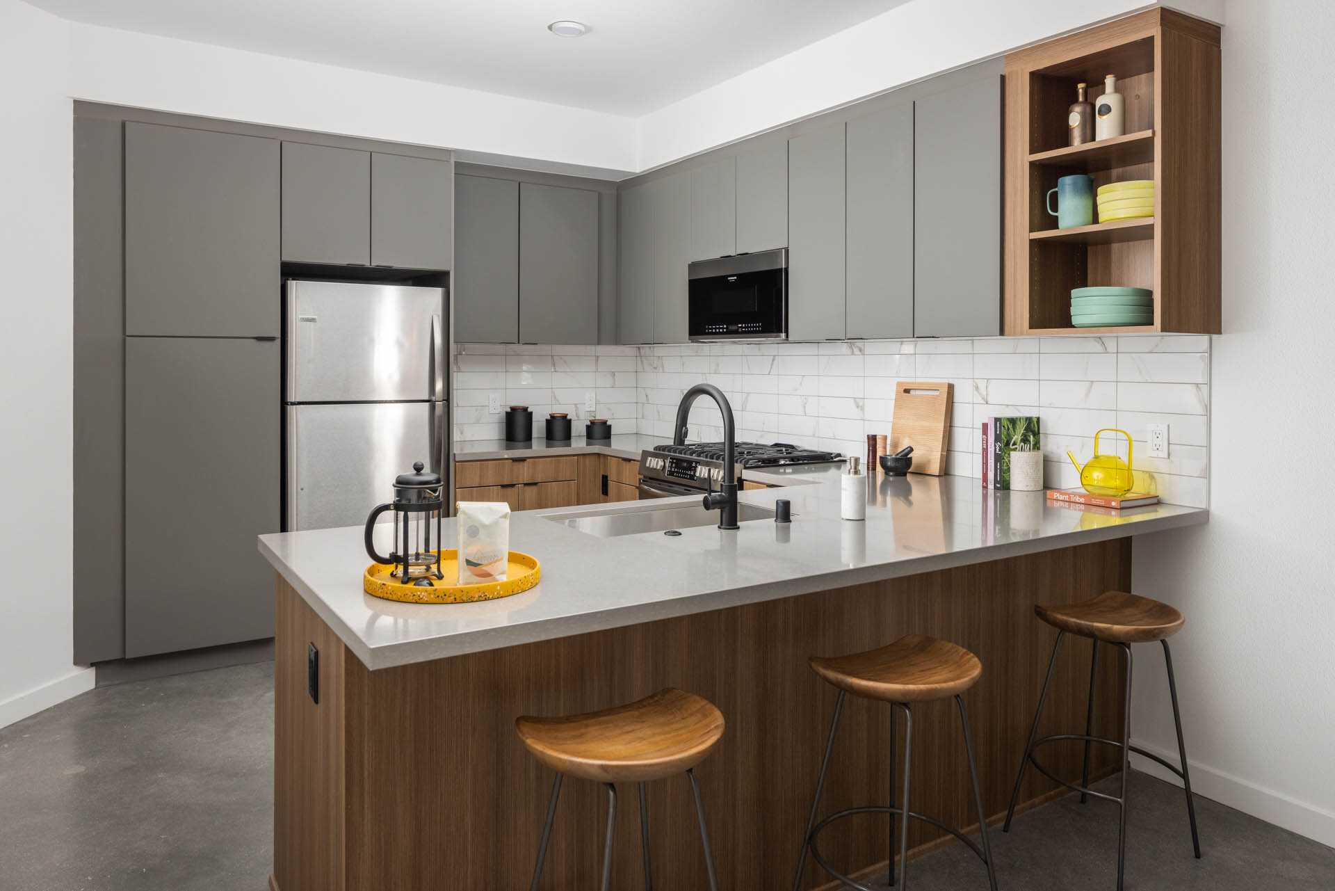
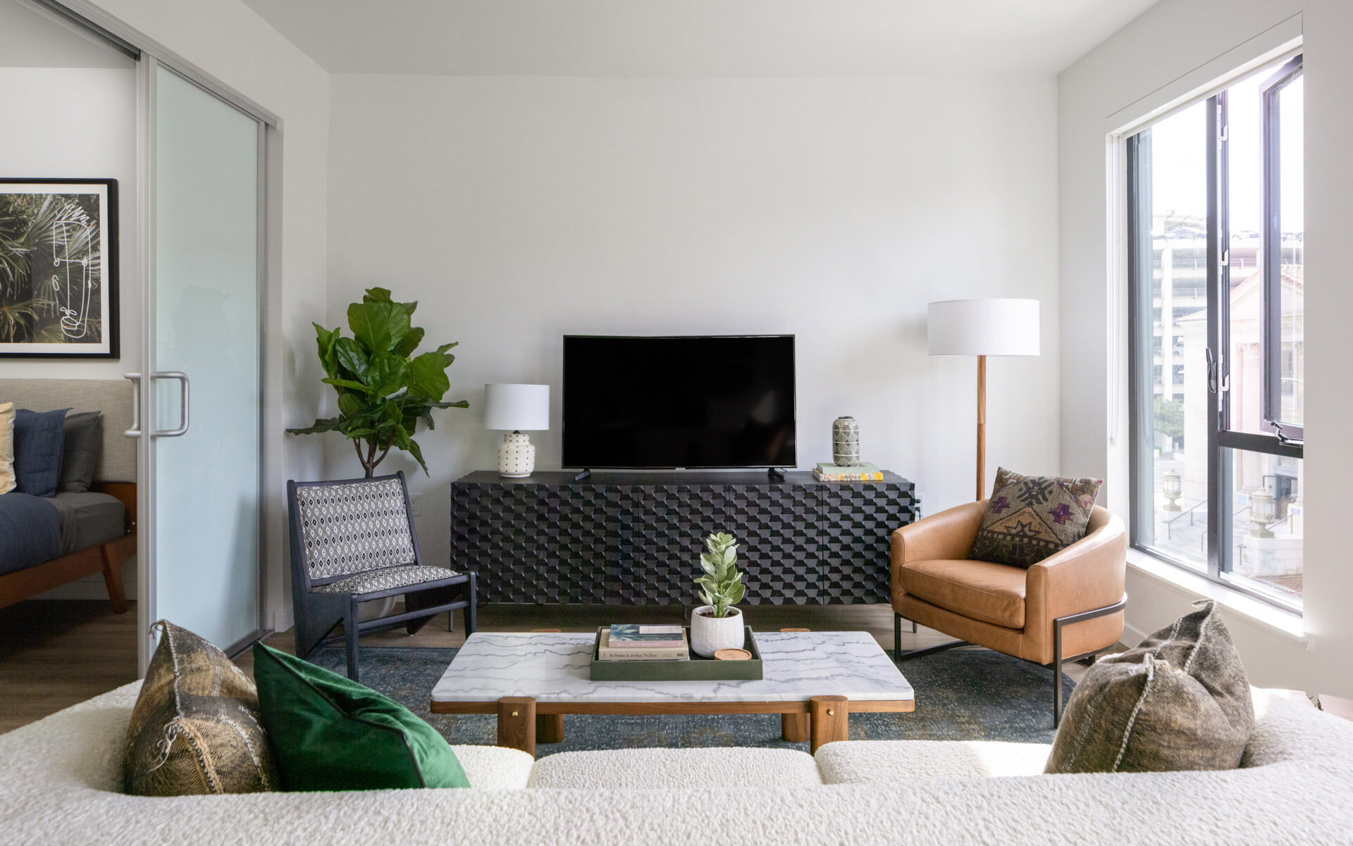
As Andrew, Corey and I entered this complex we were all taken aback by the luxe finishes that abound within The Society. Quartz countertops, nest thermostats, french door refrigerators and more are standard practice within the units and even the little things like USB outlets are included. These small touches are what sets The Society apart from other complexes in San Diego. Not to mention that this complex sits alongside the property of Town and Country, a resort which hosts a long list of amenities on its own. Town and Country is redoing their resort so that they can offer even more to their visitors and this also means that those living within The Society will have greater access to everything that Town and Country has to offer. You want to go grab a massage after a long week? Done. Have dinner at one of their amazing restaurants? Go ahead.
If you don’t feel like entering the Town and Country space you can always relax at one of the multiple lounge areas at The Society or take a break poolside to cool off from this summer heat. As we were shooting this complex we were honestly a little shocked at how many things to do there are within the confines of this one building- and I think that's an amazing direction for developers to move in. Everyone is tired of commuting. They’re tired of spending precious moments doing mundane tasks to get a little bit of R&R. They want the peace of mind knowing that when they get home they will be entering a sanctuary built with their individual needs in mind and The Society most definitely accomplishes this.
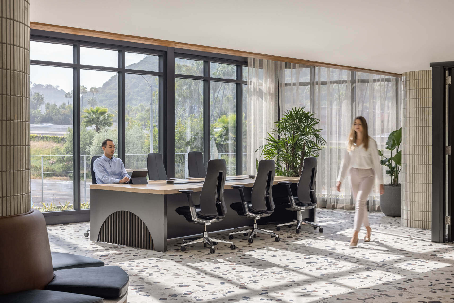
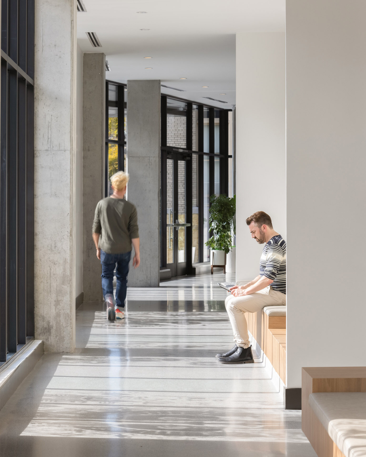
Not to mention, more and more people in the San Diego area (and California as a whole) are moving to remote work following the COVID-19 pandemic. Having a well designed space to complete your day job is a must for many in the younger crowd, and The Society excels in this endeavor as well. Throughout this day of shooting we moved through the common spaces telling the story of what daily life is like here. People working away in the lavish seating areas or else hidden away in some of the more private office style areas. Grabbing a drink at the lounge, grabbing some sun by the pool. The eclectic and neutral theme of this entire complex is conducive to both work and play and made shooting within the space a breeze.
Each residential unit boasts an outdoor balcony area, and inhabitants can move throughout the space utilizing the skywalks and interior commons areas without much hassle. Most of the areas are framed by large windows that allow natural Vitamin-D heavy light to filter in to help brighten your day (and our photography). All in all this space is extremely well designed and we have Holland Partner Group, Vida Designs PDX and of course Nash Communities to thank for that. Industry professionals, yet again, always shine through with their collective talents.
I’m excited to see where neighboring Town and Country Resort goes with their renovations and to see if they keep with the luxury theme or if they go for something more intricate and daring to match the increasingly creative undertone of the San Diego area. I’m sure they’ll maintain their record of excellence no matter what they choose to do- but these new developments always get our interest piqued as we watch them unfold. Personally, I hope to see the hat tipped to the daily needs of those within the resort in the way that the Society has managed to do so. A bike wall here, a green space there. Each of these things lend credence to the individual needs of those who reside within.
At the end of the day, it was a blessing to work with this group of amazing creators, innovators and designers to showcase the beauty and style of this development. From USB outlets to sparkling views of the water The Society has thought of everything and as always, it was a pleasure to be along for the ride. As San Diego rosters up even more of these unique developments I’m sure the clientele of the city will thank developers like Holland and NASH for thinking of the unique needs of the people living within.
Developer: Holland Partner Group & NASH Communities
Architect: BDE Architecture
Interior Design: Vida Design PDX
Resort: Town and Country
Here are some other posts you may like:
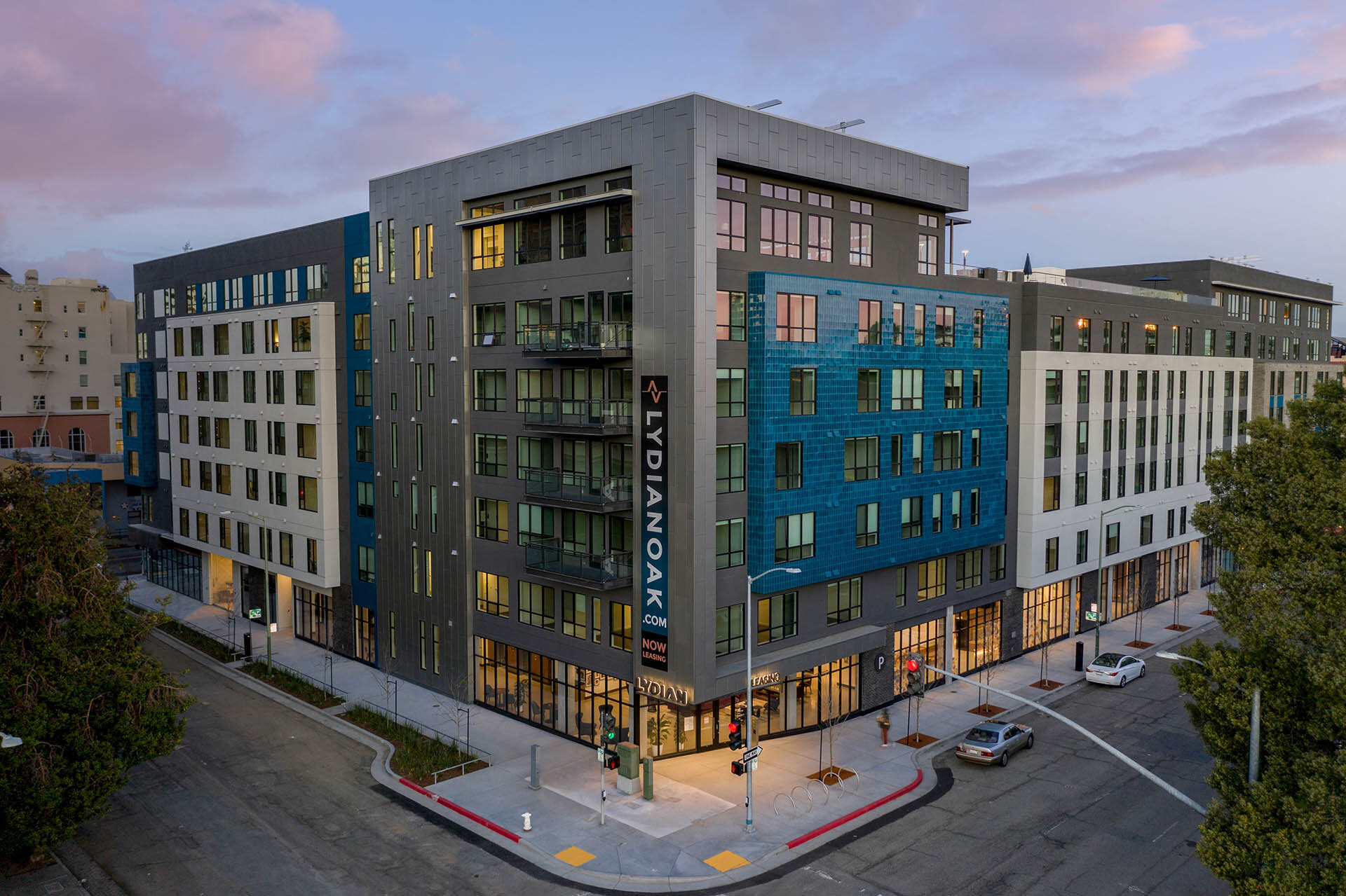
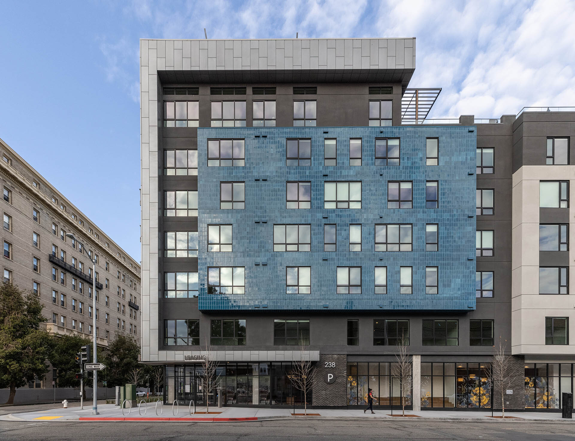
Built to Serve: Oakland Welcomes the Lydian
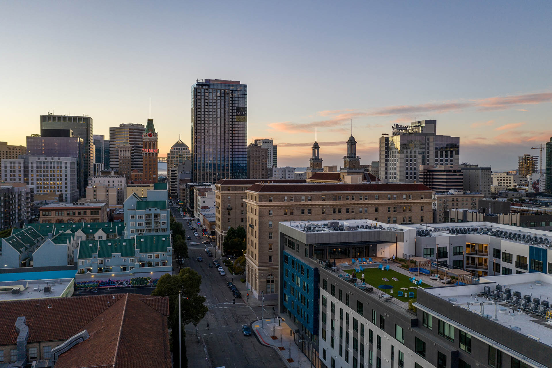
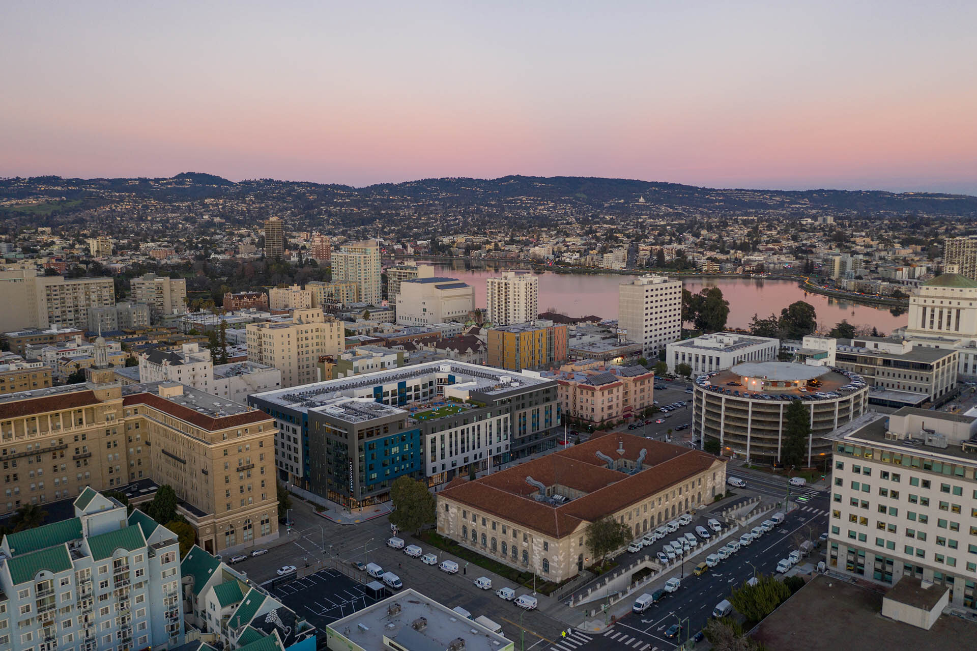
The Lydian stands as one of the most artfully crafted examples of architecture in the Lakewood District of Oakland and offers residents the opportunity to live, relax and entertain in style. Each of the three different floor plans within this building is carefully designed with fluidity of movement in mind, meaning you can spend less time managing and more time enjoying the space. Residents have the option to choose between studio spaces for the busy professional, separated bedrooms for those seeking a little more space, and even a two bedroom option which allows for an even greater footprint to call your own. Light pours in through expansive windows throughout the space to keep everything bright and airy for residents while also creating beautiful straight lines to compliment the already angular structure in architecture. In fact, the generous lighting in these spaces is one of their greatest achievements and allows residents a crystal clear view of the surrounding cityscapes.
The Lydian stands as one of the most artfully crafted examples of architecture in the Lakewood District of Oakland and offers residents the opportunity to live, relax and entertain in style. Each of the three different floor plans within this building is carefully designed with fluidity of movement in mind, meaning you can spend less time managing and more time enjoying the space. Residents have the option to choose between studio spaces for the busy professional, separated bedrooms for those seeking a little more space, and even a two bedroom option which allows for an even greater footprint to call your own. Light pours in through expansive windows throughout the space to keep everything bright and airy for residents while also creating beautiful straight lines to compliment the already angular structure in architecture. In fact, the generous lighting in these spaces is one of their greatest achievements and allows residents a crystal clear view of the surrounding cityscapes.
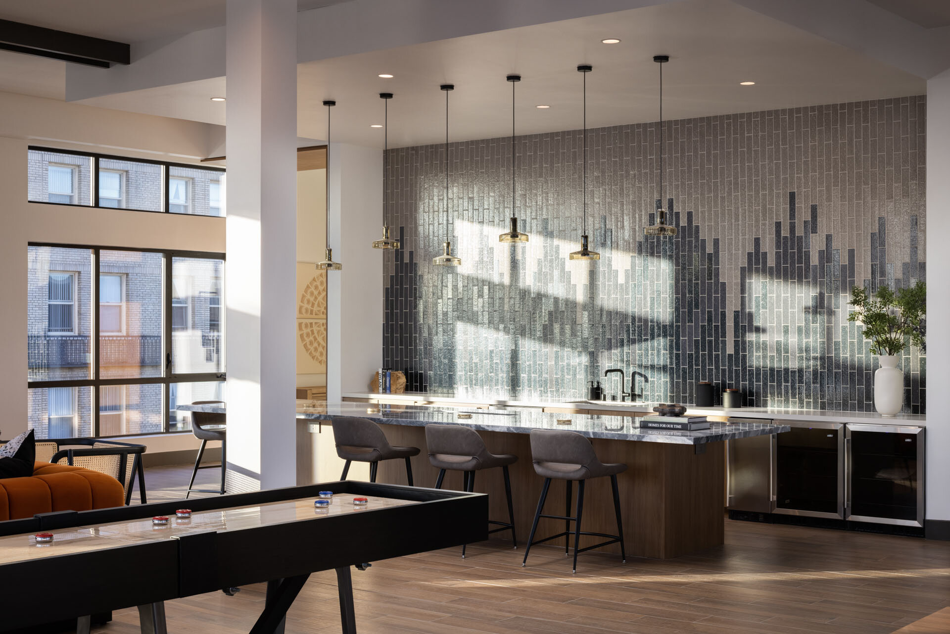
For those living day to day at the Lydian it’s easy to see how finding this perfect balance between bustling city living and the escapism of luxe amenities can be so conducive to peaceful living. The building boasts an impressive list of facilities including an outdoor rooftop lounge, dog run and fully outfitted gym- features that are definitely rare within city limits. A quick step outside brings you within walking distance of Ford Theater, Lake Merritt and the boutiques and shops of Downtown. Everything a person could want or need can be found right here in the micro-community created by The Lydian. This community is also known for being one that draws young professionals and astute individuals that enjoy combining their work with ample leisure. There is always something to do or see in the Lakewood District.
Photographing and filming within this space is a rare treat in that it lends itself so eloquently to a focus on light and human interaction. The pace of city life can occasionally be overwhelming, and taking time to notice the microcosm that is the Lydian is a wonderful step back for a content creator. There are so many moving parts, so many busy people, so many things to do- contrasted by the clean, straight lines and contrasting color palettes that The Lydian has incorporated. The architecture of this building is unmatched and really creates a smart, modern atmosphere that is both functional and beautiful.
Filming within the Lydian was a special project for us- we set up to capture time lapses of the sun dancing through the common areas as well as the apartments themselves, and were able to illustrate what a full day living here would feel like for residents. Of the ample community spaces the rooftop was especially interesting for our team. Finding an oasis of greenery that created a ‘backyard’ vibe right in the middle of a busy city was especially interesting to see. It’s easy to imagine how living in this community would be both enjoyable and well appointed- the designers have clearly thought of everything.
Developer: Holland Partner Group
Architect: BDE Architecture
Interior Design: CDC Designs
Here are some other posts you may like:
Built to Serve: The Merian in Downtown San Diego
The Merian is a residential building with 426 living spaces including three bedroom apartments, two bedroom apartments, and even studio apartments. There are also townhomes and penthouse residential spaces available. Residents of The Merian can enjoy luxury features such as quartz countertops, impressive kitchen amenities, and even Nest Thermostats. In addition, small details such as USB chargers and motorized shades come as conveniences for residents. With so many different housing selections, The Merian provides living spaces for multiple levels of family income.
With its beautiful towering presence, The Merian in downtown San Diego provides a multitude of resources for the community members who visit the building as well as the residents who live there. The Carrier Johnson architects of The Merian as well as the Holland Partner Group, specifically Holland Residential, paired together to create and build this “mixed use” structure with the intent to include aspects of the building the general public could enjoy. In addition, Vida Design contributed to the modern and chic interior design of the building including its lobby, housing areas, and public spaces. Together, these three companies fashioned a structure with many different functions for the community of East Village San Diego.
As you can see from the images, The Merian is primarily a residential building with features to include the community such as an amphitheater as well as a plaza. The public and residential spaces are decorated with sleek furniture that adorn the building like art. Carrier Johnson and Holland Residential were mindful of the already-existing local culture as they were generating ideas for the building, and so this project was designed with intense consideration and care. The Merian was created to serve as a residential building as well as a public space, and the architectural design of the building is a pillar of style and class.
About The Merian:
The Merian is a residential building with 426 living spaces including three bedroom apartments, two bedroom apartments, and even studio apartments. There are also townhomes and penthouse residential spaces available. Residents of The Merian can enjoy luxury features such as quartz countertops, impressive kitchen amenities, and even Nest Thermostats. In addition, small details such as USB chargers and motorized shades come as conveniences for residents. With so many different housing selections, The Merian provides living spaces for multiple levels of family income.
With its outdoor terrace, jumbotron, and amphitheater there is no doubt that The Merian was created to include the community along with the residents of the building. In addition to these features, the public has access to a pool, spa, and even a coffee bar. There is even a concierge on duty at all times to assist guests and community members to their desired locations within the building. The Merian was designed to be inviting for all, and the creators of this structure really hit the mark! Representatives from Carrier Johnson Duane Hagewood and Alex Gutierrez as well as employees of Holland Residential spoke in depth on the public aspect when designing The Merian.
Who Was The Merian Built For?
The Merian is a residential structure with office components as well as entertaining public spaces and retail opportunities. The representatives from Carrier Johnson as well as Holland Residential both mention in an interview that it almost was a competition between companies as to who would be able to purchase the space where The Merian now sits. Apparently, the plot where The Merian now sits was highly sought after due to its central location in the up-and-coming East Village area. When the city of San Diego began to accept bids and project proposals for the space, there were expectations laid out about the project. It was required that the plot would include affordable housing, public access, and a renovation of a historical home on the site. When Carrier Johnson and Holland Residential teamed up, they knew they wanted to create something beautiful and affordable for the community. In addition, they also wanted to create a “destination point” for the city to be proud of.
The location of the Merian is located across from the NewSchool of Architecture and Design, which is an important and essential detail to the building’s history. The NewSchool of Architecture and Design originally used the location, or plot, of The Merian before it was built as a gathering point for the East Village community. The college created events in this location that included music, food, art, and a sense of community. This is a detail the team from Carrier and Johnson as well as Holland Residential kept in mind when designing the public aspect of the building. The representatives from Carrier Johnson referred to the community gatherings as a “great hit for the residents” and, when designing The Merian, they were determined to keep that same vibe and sense of fun for the community.
When asked about their vision, Alex Gutierrez and Duane Hagewood from Carrier Johnson discussed walking through East Village to take in visuals of the community and to determine how The Merian would fit in and serve the members of San Diego. They also observed the community and took note of how their building could improve the environment and also serve the people of the area. What could they build that the people of East Village would be interested in enough to participate and visit? Alex Gutierrez reflected on the structure consisting of residential, office, and commercial spaces and said, “It really creates a dynamic place.” The representatives from Holland referred to The Merian as a “mixed use” space as well as a “gathering point for the community”. Through their care for the community and art, the experts at Holland Residential, Carrier Johnson, and Vida Design truly created an innovative structure and atmosphere.
In addition to designing The Merian to include office spaces and public access, the creators from Carrier Johnson and Holland Residential knew it was important to include affordable housing within the structure. The team designed a variety of homes ranging from smaller studio spaces to larger townhomes and penthouse choices. With this variety in housing comes diversity in the levels of income needed to live at The Merian. As Alex Gutierrez said in the interview, “You don’t have to be on the high end of the spectrum to afford to live here.” The Merian was purposely designed to invite diversity through its front doors and so it has become a well-received building in the community of East Village in San Diego.
Developer: Holland Partner Group
Architect: Carrier Johnson + Culture
Interior Design: Vida Design PDX


